

Young and cheeky
The task for the packaging designers was to remain true to the trademark with the strong color combination of pink and turquoise and at the same time to become more contemporary and grown-up. The brand definitely wants to retain its young, cheeky identity. "We bring around ten new products onto the market every year. Many of them are absolute novelties in German-speaking retail. We want to constantly surprise baking fans, provide them with exciting new products for creative baking and present the right products for current baking trends as widely as possible in supermarkets," says Rüdiger Settelmeier, co-founder and co-owner of Dekoback, summarizing the Decocino brand essence.
Eating habits at a glance
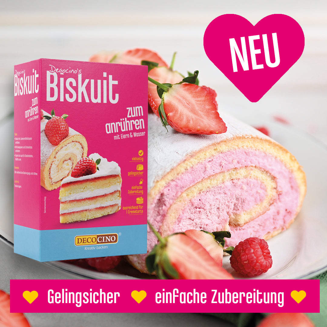
What is particularly striking about the new packaging is the new font, the elimination of "bubbles" as a design element, the trendy serving suggestions and the list of the key product properties in the form of so-called "icons", color-highlighted symbols and terms directly on the front of the packaging. This is intended to make the packaging appear clearer, clearer and less playful. In addition, dietary habits such as "gluten-free" or "vegan" were included in the product properties on the front, as these are becoming increasingly important for consumers. "Customers should be able to see at a glance what is special about our products ," explains Settelmeier.
Strong layout
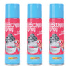
The packaging designers went one step further so that customers can quickly understand what makes the products special and what they can be used for when baking and decorating when they walk through the baking shelves. They divided the product range into four categories and assigned different design attributes to each category that reflect the respective special features. The first category includes the standard range and is in the classic Decocino look in pink and turquoise. The second category brings together all the glitter products. They have a black background instead of pink, which makes the glitter effect of the products and the elegant and glamorous look that the products give the baked goods stand out more. In the new baking mixes and the chocolate drops with no added sugar, the pink has been reduced by around a third, as a reference to the approximately 30 percent lower calorie content. The fourth and final category is the organic line, which is also new, in a vintage style with a background in delicate pastel shades that resembles parchment paper.
Less plastic
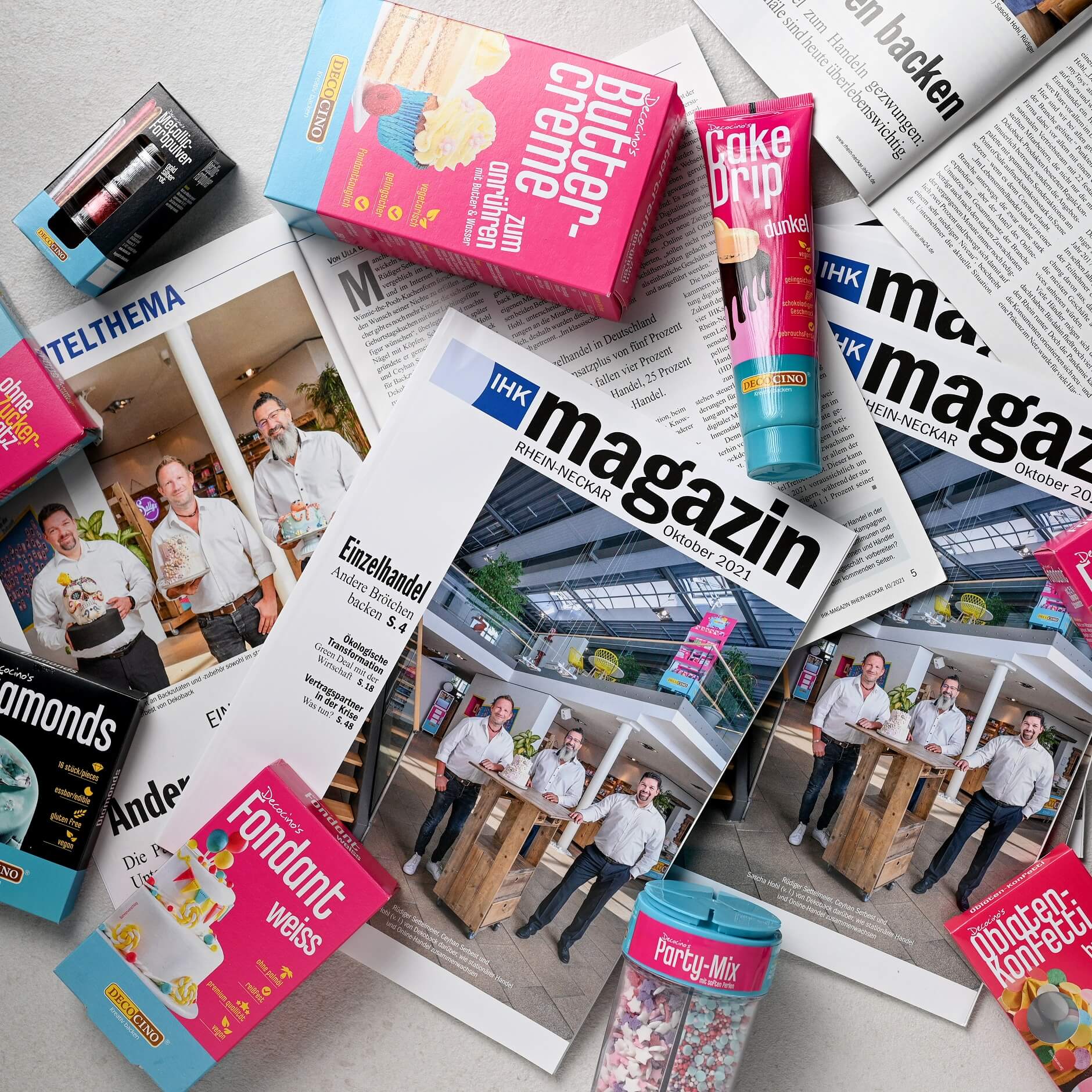
There are also changes in the packaging materials. "We want to do without plastic as much as possible in the future and gradually change our packaging," summarizes Settelmeier. The packaging of the edible food glue, one of Decocino's best-selling products, and the color powder sets have already been changed from blister packs made of plastic to folding boxes made of cardboard. The food coloring pastes and sugar writings, which have long been offered in folding boxes in Germany, have now also been switched from plastic to paper packaging in the export business with the relaunch.
mammoth task
In addition to the design agency, the in-house graphics department was also heavily involved in the conversion of around 200 packages, plus the numerous country variations for export. "The whole thing was a mammoth task that had to be completed alongside day-to-day business," says Settelmeier. "But the packaging relaunch was worth it. The initial response from retailers has been very positive."
Helmstadt-Bargen, November 15, 2021